Reflective e-paper remains readable in direct sunlight.
E-paper reflects ambient light like printed paper instead of fighting it with a backlight.
Option 01 / Connected stanchion signage
A slim, sunlight-readable e-paper layer for the Museum’s existing queue system—bilingual, remotely managed and designed to stay visible.
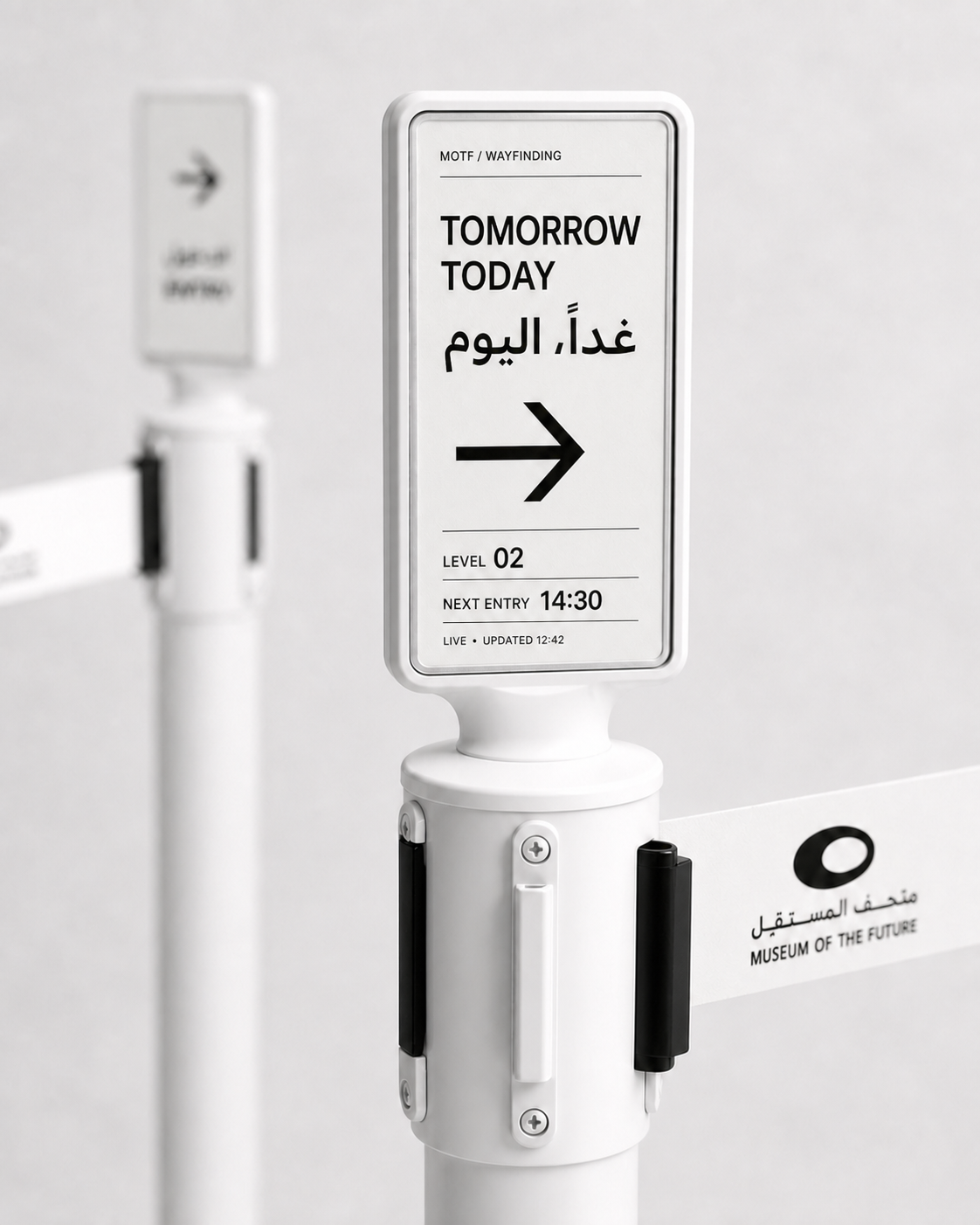
Interactive configuration / 7.5-inch + 10-inch retrofit
Compare both display sizes in changing light.
The stanchion and belt stay.
Drag to inspect
Why e-paper
E-paper reflects ambient light like printed paper instead of fighting it with a backlight.
Power is needed to change the image—not to keep the last frame visible.
Working portrait active areas: approximately 98 × 163 mm and 131 × 218 mm. Final cut-outs follow the selected panel datasheets.
Working low-power profile
This initial performance envelope gives the MOTF prototype a practical basis for battery, refresh, connectivity and fleet-management design before final component selection.
Working target for prototype validation. Actual endurance depends on update frequency, Wi-Fi signal, panel size, temperature, electronics and battery capacity.
Initial engineering profile—not a final hardware commitment. Urgent content can refresh faster; static messages preserve battery.
Device-initiated content pull
Last-approved-frame fallback
Battery + Wi-Fi fleet health
Low-battery alerts + OTA updates
All figures shown are working assumptions for prototype design—not final MOTF device commitments. Final specification follows component selection, enclosure engineering and an on-site duty-cycle test.
Webedia custom build
Working design basis: vertical 7.5-inch and 10-inch modules—approximately 98 × 163 mm and 131 × 218 mm active area—mounted on the existing white retractable-belt stanchion. Final adapter diameter, enclosure cut-outs, operating temperature, battery, radio and ingress protection follow physical measurements and the selected panel datasheets.
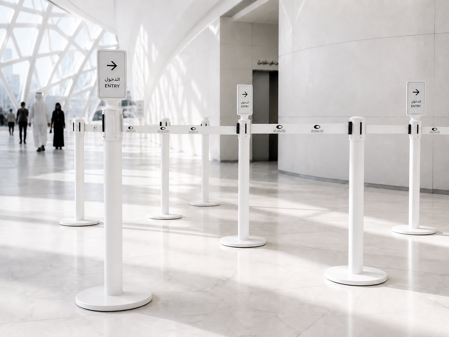
E-paper / Placement strategy
The retrofit belongs at queue entries, route changes and operational decision points—not on every stanchion. Standard posts remain untouched between the selected digital touchpoints.
Architectural signage
Option 02 / Permanent installations
The architectural position can stay fixed while the display technology changes—from a conventional high-resolution surface to spatial content or mechanically choreographed screens.
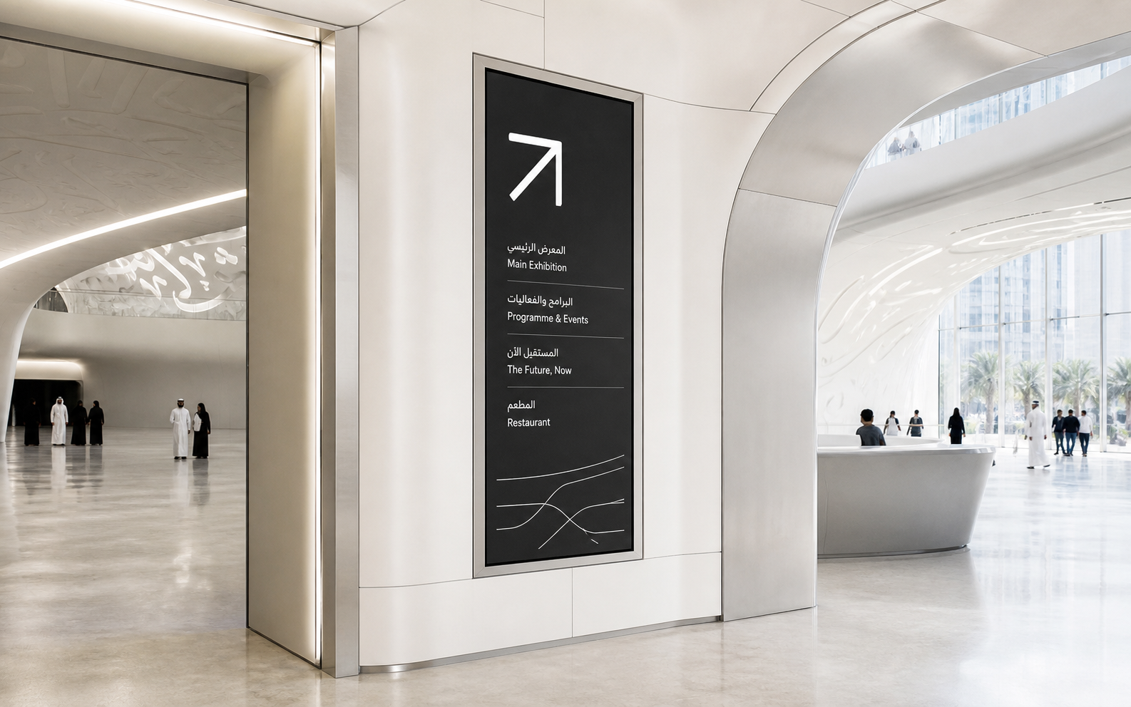
02A / Standard / architectural
The most direct permanent display path: a high-quality, fine-pitch LED surface integrated into a wall, portal or threshold for crisp programmes, information and wayfinding.
Final screen size, pixel pitch, brightness, thermal management, servicing and power routing follow the chosen location and site survey.
Portable information
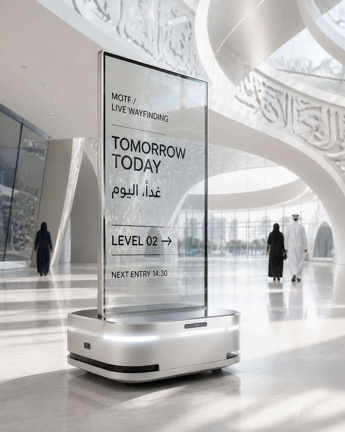
Portable transparent touchscreen
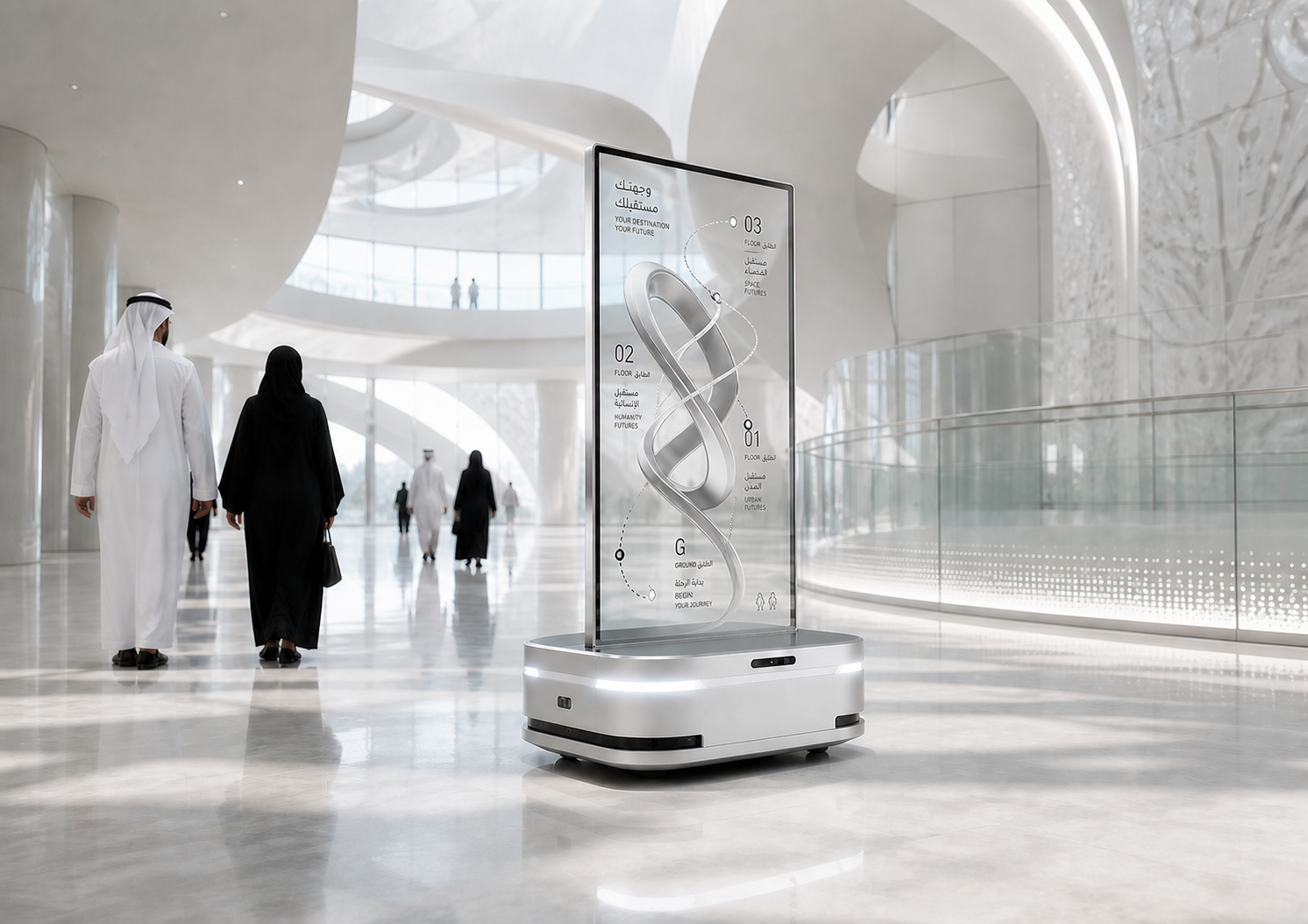
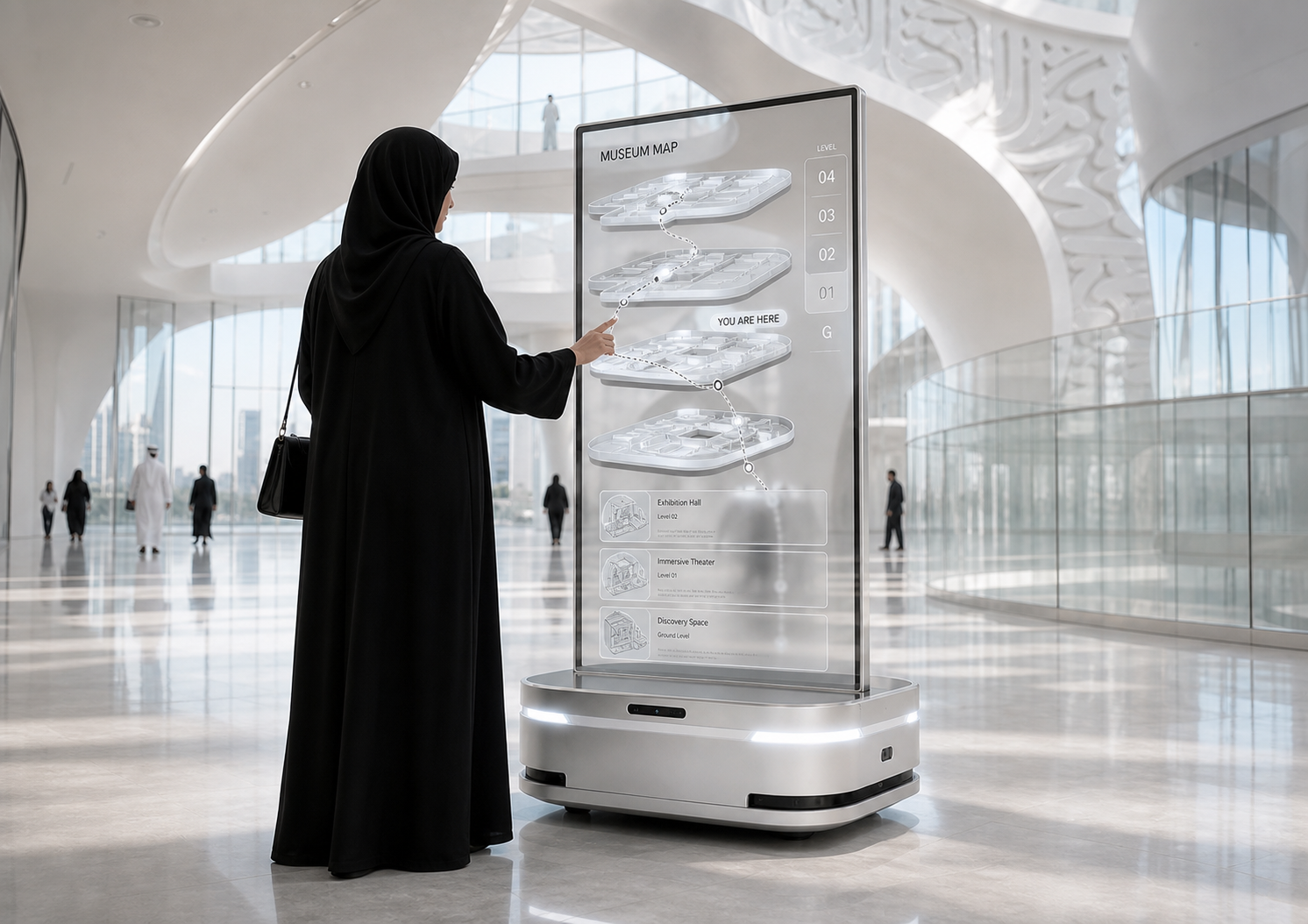
The autonomous base makes the 55-inch transparent OLED an ultimate portable setup: reposition it quickly for a queue, lobby, event or route change, then park it as a stable touchscreen. Once in place, visitors can use it for information, programmes and interactive wayfinding.
Concept direction—not a final product specification. Touchscreen integration, parked stability, route safety, localization, supervision, battery duty and accessibility require specialist engineering and a controlled site pilot.
Software layer / All display formats
The Museum can prepare, approve and publish bilingual information across every display family from one place. Each endpoint keeps its own content rules, location, schedule, health and safe fallback state.
Next entry
الدخول التالي
14:30● APPROVED CONTENTFormat rules passedReady for operational approval
Locked typography, spacing and Arabic/English hierarchy protect consistency across every screen technology.
Address a stanchion, LED wall, hologram, kinetic installation, robot, floor or the full Museum estate.
Set start and end times for admissions, programmes, closures, route changes and show moments.
Role-based access and an audit trail make every public change attributable and reversible.
See battery, signal, playback, parked location, motion state, last sync and faults according to device type.
Preserve the last frame, play an approved idle scene, park a robot or return kinetic hardware to its safe home state.
Webedia Content Studio / Managed service
With Webedia, the hardware and control platform can come with the content that makes them useful, beautiful and unmistakably MOTF. We create one idea, adapt it intelligently to every display format, and keep the system alive after launch.
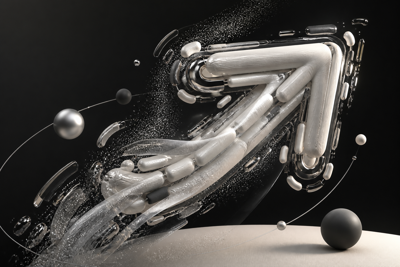
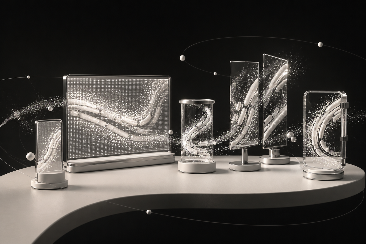
Every spatial concept begins with a location-specific render: the object, light, scale and viewing angle are designed around the actual holographic system before production. Think dimensional wayfinding, evolving artefacts, data sculptures and 3D calligraphic forms—not a flat video forced into a new screen.
Bilingual queue, admission, programme and wayfinding templates designed for instant comprehension, daylight legibility and low-refresh operation.
High-resolution motion identities, programme loops, live information and transparent-screen compositions built for the exact dimensions and sightlines of each installation.
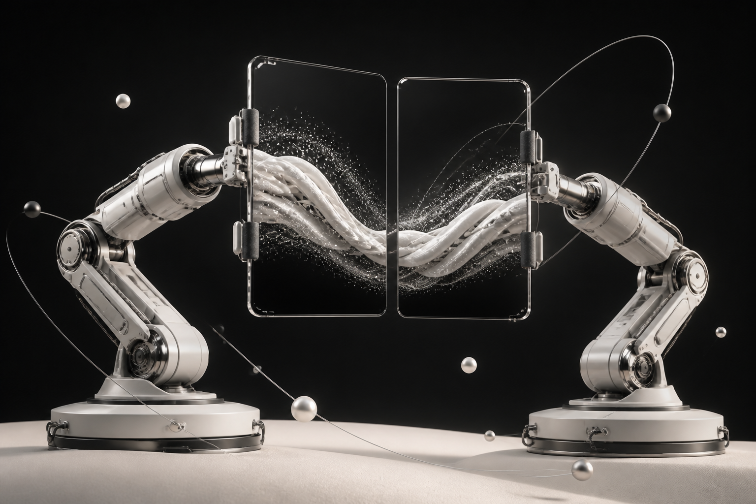
Each robot carries its own screen and content. Use them separately for parallel information, or bring both displays together so imagery and motion resolve into one larger shared composition.
Ongoing content as a service
Webedia can run the content programme as an ongoing service: maintaining templates, producing seasonal creative, adapting campaigns, preparing urgent operational updates and publishing approved work through Display Control.
The next useful step
The site visit should measure actual light, viewing distance, queue behaviour, power and network access—then select one location for a full-scale e-paper prototype and one controlled test for the future-facing concepts.